New Feature: Navigation Updates
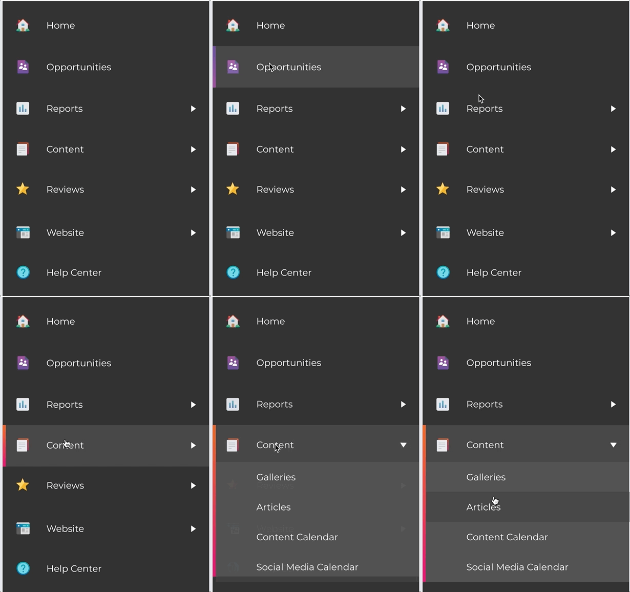
We've updated the left-hand navigation for your DoctorLogic account to make it easier and faster to find the things you are looking for and discover new parts of our platform!
Last week we rolled out the new updates to the left-hand navigation inside your DoctorLogic account. Have you had a chance yet to check it out? We designed these updates to make it even easier to access the features you use regularly and discover other parts of the platform that can help your practice grow.

Most importantly, we’ve made these updates based on feedback we received from you, our valued customers. Thank you again for sharing your ideas and input!
What’s New?
- Simplified section labels. We’re using a single word to describe what’s in each section to make it crystal clear for all customers.
- Refreshed icons for all main navigation sections. Now in color!
- One click access. Sections that don’t have any drop-down menu items (ex. Opportunities) will only require a single click to reach the desired location.
- Menu is open by default when you log in. You can still manually collapse it if you choose.
We hope you find these new navigation changes useful and that they improve your overall experience within your DoctorLogic account. If you have any questions or feedback about these recent changes, please email us today.
For additional information about these recent upgrades, please visit our help site.
